Over the past decade, reactive and responsive design have emerged as two of the most popular web design approaches. Both aim to optimize the user experience across different devices and screen sizes. But they achieve this in different ways.
In this in-depth guide, we’ll compare reactive and responsive web design to help you understand the key differences and determine which is right for your needs.
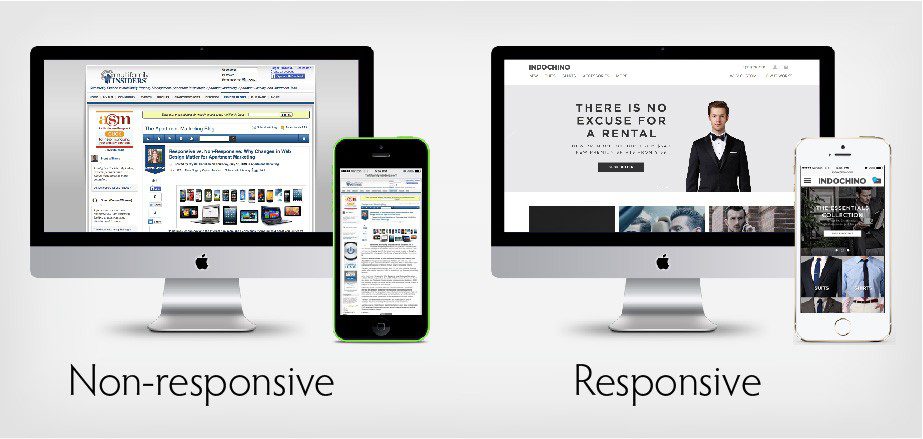
What is Responsive Web Design?
Responsive web design (RWD) has been the go-to approach for many websites since it gained popularity around 2010. The goal of responsive design is to build websites that adapt their layout and elements to look great on any screen size.
With RWD, website content is dynamically resized, rearranged, and optimized based on the visitor’s viewing device. For example, navigation menus may convert into “hamburger” menus on mobile. Images and text resize smoothly. Columns stack vertically instead of side-by-side.
By serving the same HTML code to all devices and adjusting styling and layout with CSS, responsive sites provide an optimal experience for desktop, tablet, and mobile visitors. Images resize, text reflows, and elements shift as needed without horizontal scrolling or zooming.
Responsive Design Features:
- Fluid layouts using % instead of fixed pixel widths
- Flexible images, videos and embeds
- Media queries to adapt styling for different screens
- Mobile-friendly navigation and menus
- Responsive content stacking and arrangements
- Smooth image, font, and element resizing
Responsive design has clear advantages in providing consistency across devices and simplifying development. But RWD sites can become complex for larger websites. Performance can also suffer on mobile as all assets load.
What is Reactive Web Design?
Reactive web design (also known as adaptive web design) takes a slightly different approach. Instead of one responsive site, reactive design creates multiple versions of a site specifically tailored to different devices.
With reactive design, the server detects each visitor’s device screen size and serves a pre-built version optimized for that viewport. For example, phone users may get a dedicated mobile site while tablet and desktop users see progressive enhanced versions tailored to their larger screens.
Detecting devices and serving customized sites allows reactive design to optimize UX even further for each experience. Site functionality can adapt beyond just layout. Content can be geared towards usage patterns on that device.
Pages are built using flexible HTML, CSS, and JavaScript frameworks like React, Angular, and Vue. This enables efficient reuse of components between versions. Real-time data and dynamic content updates are easier with reactive designs.
For better results you can check our services for UI and UX design
Reactive Design Features:
- Device detection to serve adapted experiences
- Separate sites optimized per device
- Component-based architectures for flexibility
- Pre-rendering pages per device
- Dynamic data integrations
- Focus on performance per device
The downside of reactive design is the extra development work of building multiple site versions. It also means content must be synchronized across templates. But the benefit is highly customized sites tailored to each device’s unique experience.
Responsive vs Reactive Design:Key Differences at a Glance
RWD:
- One responsive site adapts across all devices
- Fluid, flexible layouts dynamically resize
- All assets load for all visitors
- Simpler build with one codebase
Reactive:
- Multiple versions tailored per device
- Assets only load per relevant experience
- Greater optimization customized per device
- More complex build and content syncing
Now let’s explore the distinctions and tradeoffs in more depth.
Responsive vs Reactive: Detailed Comparison
User Experience
Responsive – The UX focuses on consistent flexibility across devices. Navigation, layouts, images, and content adapt smoothly. But RWD doesn’t account for usage differences across devices. The experience stays uniform.
Reactive – UX is highly customized per device. Mobile sites are streamlined with simplified navigation. Tablet sites have magazine-style layouts for leisurely browsing. Desktop sites offer maximal functionality and content.
Performance
Responsive – All assets download for all visitors regardless of device. This can mean slower load times on mobile. RWD sites rely on design tricks to minimize resources for mobile. Large images can still impact speed.
Reactive – Sites are optimized specifically for each device’s resources. Mobile sites are ultra-lean with smaller images, less bloat, and scaled back frameworks. Tablet and desktop sites take advantage of faster connections and more capable hardware.
Responsive vs Reactive Design Development
Responsive – One set of templates built with flexible grids and components. Media queries adapt the layout and styling. Generally simpler to develop than reactive sites.
Reactive – Separate templates are built for each intended device. A component library enables reuse across platforms. More complex build, but allows for greater customization and optimizations for each experience.
Content Management
Responsive – All content is shared across device experiences. This simplifies content creation and synchronization. Authors don’t have to manage content variations.
Reactive – Content can be tailored to each device, based on usage data and analytics. But authors must manage content variations across templates, which complicates workflows.
SEO
Responsive – Avoids duplicate content issues by using one set of URLs across devices. Canonical tags help search engines understand various templates all serve the same content.
Reactive – Requires extra care to avoid duplicate content risks. Must implement 301 redirects between versions and use canonical tags properly. Provides more opportunities for site-wide optimization.
Analytics
Responsive – Measures all traffic in aggregate. Can break down metrics by device using dimensions. It’s harder to analyze engagement for each specific experience.
Reactive – The ability to implement separate tracking for each site version provides more granular analytics. Metrics specific to each platform can inform targeted optimization.
As this comparison shows, both RWD and reactive design have their unique strengths and weaknesses. Choosing the right approach depends on your site’s specific goals, content, and technical considerations.
When to Use Responsive vs Reactive Design?
Here are some best practice guidelines on when to choose responsive or reactive approaches:
Responsive works best for:
- Content-focused sites like blogs
- Smaller websites
- Sites without heavy dynamic content or data requirements
- Marketing sites promoting one brand/product
- Sites on tighter budgets or with smaller teams
Reactive is preferable for:
- Large websites with diverse content types
- Sites with complex web apps and functionalities
- Media-heavy sites like galleries or video streaming
- Ecommerce sites with multiple product variations
- Sites already built using web frameworks like React, Angular, etc
Most standard marketing websites with 10-20 pages of content do fine with RWD. Complex web apps with 100+ pages and diverse templates often justify a reactive approach.
But you don’t have to choose just one. Many websites take a hybrid approach using responsive design for content-focused sections and reactive frameworks on interactive tools or apps embedded within those pages.
Analyze your specific goals, user behaviors per device, content strategy, and technical architecture to determine if responsive, reactive, or a blended approach makes the most sense.
Making Reactive and Responsive Design Work Together
If you choose a hybrid responsive + reactive approach, here are some tips to integrate both smoothly:
- Use a component library to maximize code reuse of headers, footers, etc
- Implement redirects across versions to avoid duplicate content
- Set up shared content APIs to synchronize data assets where possible
- Use A/B testing to validate and improve UX per version
- Add version switching to allow moving between experiences
- Use web analytics to identify usage patterns per site version
- Scale shared assets like images dynamically for performance
- Automate builds and deployments to simplify managing versions
With planning and strategic implementation, you can harness the strengths of both responsive and reactive design frameworks on one site.
The Future: Automated Experience Optimization
Looking to the future, Expect to see more AI-powered solutions that aim to bring reactive personalization to responsive designs.
Instead of manually building multiple site versions, the goal is to automatically test and deliver optimized page variations to each visitor in real time.
Tools like BuyerExperience use AI and a headless architecture to dynamically assemble site components tailored to each user’s journey. This emerging approach blends the continuity of responsive with the personalization of reactive.
As technology progresses, the lines between reactive and responsive design will continue to blur. The end goal is highly personalized and performant digital experiences customized per user, device, and context.
Summary: Key Takeaways on Reactive vs Responsive Approaches
- Responsive design creates one flexible site adjusting layout/styling across devices
- Reactive design builds separate sites customized per device experience
- Consider UX, performance, content, SEO, analytics to determine best approach
- Responsive works well for simpler sites, while reactive benefits complex web apps
- A hybrid model can combine the benefits of both on one website
- Emerging solutions will bring automated experience optimization to both techniques
Understanding the nuances helps ensure you choose the right web design strategy. Evaluate your goals, resources, and technical environment to determine if responsive, reactive, or a blended approach is the best fit. With a strategic vision and plan, you can build sites tailored for today’s multi-device world.
Frequently Asked Questions About Responsive and Reactive Design
What are the advantages of responsive design?
Benefits of responsive design include:
- Simplified development with one codebase
- Consistent experience across devices
- Flexible, adaptive layouts and elements
- Improved SEO with one set of URLs
- Cost-effective for smaller sites
What are the advantages of reactive design?
Benefits of reactive design include:
- Greater optimization customized per device
- Ability to tailor content and functionality
- Enhanced performance by reducing assets/code
- More customizable analytics per experience
- Works well for complex sites and web apps
Is responsive or reactive design better for SEO?
Responsive design is generally better for SEO, avoiding duplicate content with one URL structure. But reactive sites can also be optimized for SEO through proper redirects and canonical tags.
Is reactive design more expensive than responsive?
Generally yes, reactive design costs more due to the extra development work of building multiple site versions. But costs ultimately depend on the overall complexity and customization needs of the project.
What is an example of reactive design?
Most ecommerce websites use a reactive approach, with separate mobile and desktop sites. Airlines often use reactive design, serving optimized experiences for web, mobile web, mobile app, etc.
Topics: Top 10 Website Development Trends to Watch Out for in 2023
The Top 10 Ecommerce Website Development Companies of 2023
The Ultimate Guide to Getting a Professional Website for Your Business
Implementing Adaptive Software Development to Master Agile Project Needs
Recent Comments